


VIEW IN MY ROOM
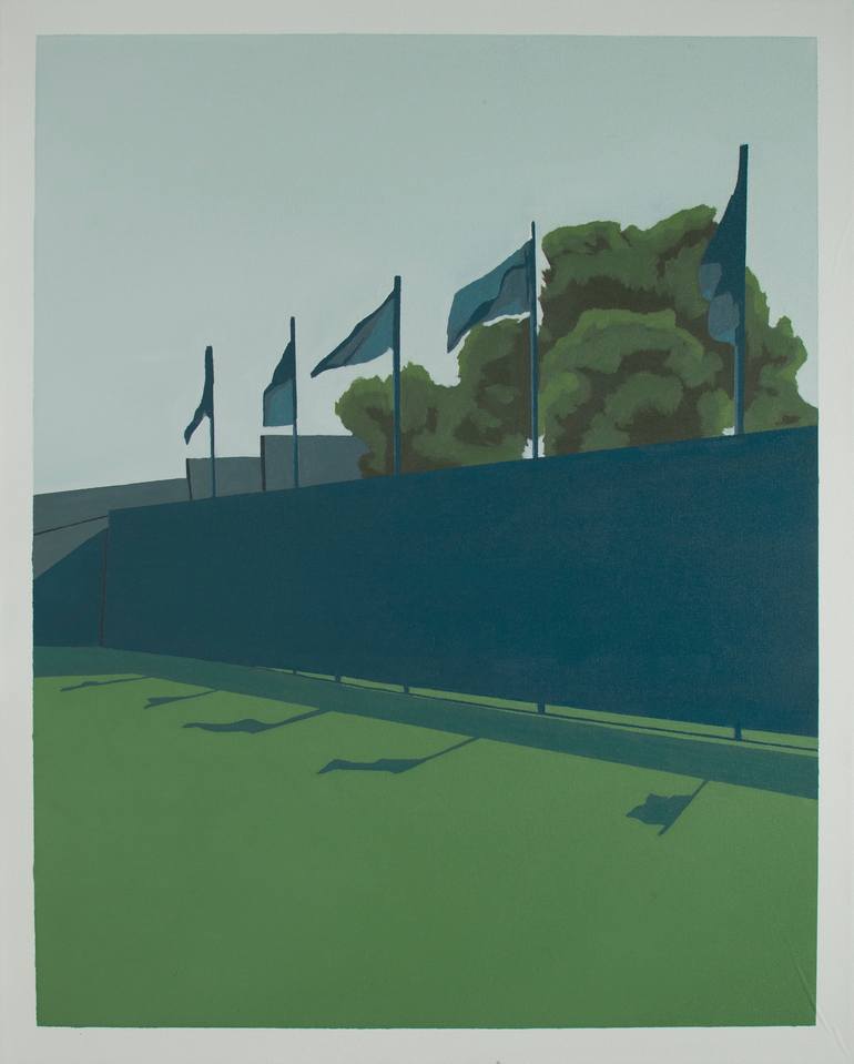
RogersCup Toronto 1 Print
Italy
Select a Material
Fine Art Paper
Select a Size
8 x 10 in ($48)
Add a Frame
White ($80)
Artist Recognition
Artist featured in a collection
About The Artwork
When I paint I try think about life through my experiences, not about art. What I want to express is a mere compositional and chromatic harmony. My goal is to express the composition of the picture at its best. The major influence comes from David Hockney’s study, in particular his perception and representation of reality. His way of expressing himself during the 60s, with his simple and effective message “less is more”, is my first point of reference. Like him, I am convinced that every person has a personal vision of the world, or at least each of us decides to see the one that most closely conforms to his or her interests. And I do so when I decide what to paint. The reality I want to see is shaped by the contrast of the Colors in the Light and in the Shadow. In a certain sense, I also bring light into the shade. I nurture an irrepressible passion for colors, I focus on the study of it and the relationship that one color has with another, since a color can only be defined if it is combined with another one. I often express myself through colors and geometries, and I must say that such research gives me a deep peace of mind. I get a lot of inspiration from Rothko and Albers, two of the best postwar artists. My job is the research of balance and aesthetics. For me art means living life and the topics I cover are in-depth experiences which I try to study in their details. What characterizes the images I produce are the light, the bright colors, the abstraction from the main action and the immobility in the crystallization of the moments. The technique I use is that oil on canvas 100% cotton. I strive for a simple, clean and essential style. The flat backgrounds, the attention in the use of light and the strong colors create an aesthetic balance. this is the first work dedicated to the RogersCup tournament in Toronto where one of the most prestigious events of the tennis calendar is held every two years. The "Court" series depict shots that inspire a sense of abstraction from the main action. I have been studying tennis for about one year and a half. This sport is like a metaphor of life, made of pauses, love and breaks.
Details & Dimensions
Print:Giclee on Fine Art Paper
Size:8 W x 10 H x 0.1 D in
Size with Frame:13.25 W x 15.25 H x 1.2 D in
Frame:White
Ready to Hang:Yes
Packaging:Ships in a Box
Shipping & Returns
Delivery Time:Typically 5-7 business days for domestic shipments, 10-14 business days for international shipments.
Handling:Ships in a box. Art prints are packaged and shipped by our printing partner.
Ships From:Printing facility in California.
Have additional questions?
Please visit our help section or contact us.
Italy
Mauro Baio was born on the 6th of May 1991 in Lecco, a small town by Lake Como, Italy, situated between the lake and the mountains and characterized by its beautiful views and unique landscapes. This singular environment leads to a natural infatuation for the dichotomy and the contrast between lights and shadows, which derive from the shape of its morphology. This is the setting in which the propension for drawing became a passion and brought the artist to undertake the artistic career. Five years ago, he was diagnosed with a chronic disease known as arthritis. But the discomfort turned into motivation and in 2015 he enrolled at the Academy of Fine Arts in Venice, Visual Arts course, faculty of Painting, where he graduated in 2018 with honors. There he was able to increase his profound research for lights through colors.
Artist Recognition
Artist featured by Saatchi Art in a collection
Thousands Of Five-Star Reviews
We deliver world-class customer service to all of our art buyers.
Global Selection
Explore an unparalleled artwork selection by artists from around the world.
Satisfaction Guaranteed
Our 14-day satisfaction guarantee allows you to buy with confidence.
Support An Artist With Every Purchase
We pay our artists more on every sale than other galleries.
Need More Help?