
VIEW IN MY ROOM
Golden – 15-01-21 Drawing
Netherlands
Drawing, Color on Paper
Size: 11.7 W x 8.3 H x 0 D in
Ships in a Box
Shipping included
14-day satisfaction guarantee
Artist Recognition
Featured in the Catalog
Artist featured in a collection
About The Artwork
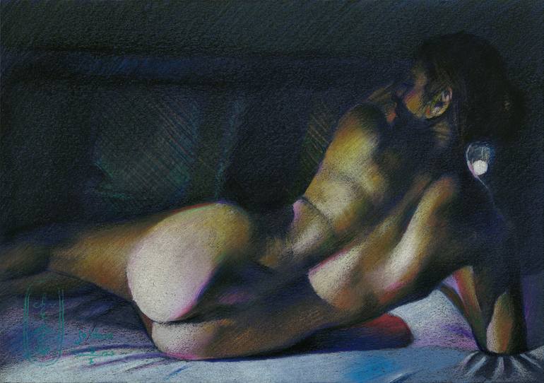
Golden – 15-01-21 Golden Series In autumn 2020 I made my last drawing in the Golden series, called Golden Reality – 14-09-20. Since then I almost forgot about that series because I started drawing in graphite again after my big Frida Kahlo Project. Colored pencil initially was not my weapon of choice. Instead I was drawn towards the direction of international recognition because of my monochrome drawings. They still sell well. Albeit this success I like to vary as you may know by now. Work in Progress The direct reason why I picked up my colored pencils is my work in progress under the working title ‘The Girl and the Pheasant’. Of late I realized I did realistic skin textures in black and white and in pastel for a long timel. Even though the latter is in color the execution thereof is done in my hatched strokes. Nevertheless that one is merely impressionistic because of the lines according to the principles of divisionism. Jealousy No, the true reason, my specators and readers, is that I still am jealous of the techniques of masters like Ingres, Van Dyck and so many others. Take The Valpinçon Bather (La Grande Baigneuse) for that matter. My realistic art work is scarce in showing smooth color gradients and subtle color shifts as can be detected and enjoyed in that painting. It is time to expand my view in that direction. Roundism will not walk away but this needs to be developed as well. Added Value Now I expressed yet another jealousy (a previous one was my jealousy for Degas’ drawing talents) it is time to express criticism as well. Even though the aforementioned Ingres’ painting show mastery in the depiction of smooth textures as to thousands of different gradients, sometimes I feel the colors look rather bland. Another example is his painting ‘The Turkish Bath’. The value I would like to add to art history is some kind of expressionist color exaggeration or personal choice rather than depicting what I see. Stronger colors Then I remembered my oil painting ‘Henriëtte (2013) (sold)’. In that one I used traditional techniques like a verdaccio undercoat and glazed layers but I crancked up the color shits like reds and greens a bit. Just as in oil I applied multiple layers of colored pencil patches on top of one another. As such it is a difficult technique that is very unforgiven but I am pretty sure I want to get to the bottom of this to finetune it. For now I like the fact that the yellows, greens, oranges and blues blend into eachother but not as smoothly as in Ingres’ works. They also show a higher degree of saturation. Perhaps it is a new kind of expressionism secretly wrapped with a golden bow and served out as realism. Colored pencil drawing on Talens Mixed Toned Color paper (21 x 29.5 x 0.1 cm) - A4 format) Artist: Corné Akkers
Details & Dimensions
Drawing:Color on Paper
Original:One-of-a-kind Artwork
Size:11.7 W x 8.3 H x 0 D in
Frame:Not Framed
Ready to Hang:Not applicable
Packaging:Ships in a Box
Shipping & Returns
Delivery Time:Typically 5-7 business days for domestic shipments, 10-14 business days for international shipments.
Handling:Ships in a box. Artists are responsible for packaging and adhering to Saatchi Art’s packaging guidelines.
Ships From:Netherlands.
Have additional questions?
Please visit our help section or contact us.
Netherlands
1969, born in Nijmegen. My work can be seen in many countries all over the world. Corné employs a variety of styles that all have one thing in common: the ever search for the light on phenomena and all the shadows and light planes they block in. His favorites in doing so are oil paint, dry pastel and graphite pencil. He states that it’s not the form or the theme that counts but the way planes of certain tonal quality vary and block in the lights. Colours are relatively unimportant and can take on whatever scheme. It’s the tonal quality that is ever present in his work, creating the illusion of depth and mass on a flat 2d-plane. Corné combines figurative work with the search for abstraction because neither in extremo can provide the desired art statement the public expects from an artist. Besides all that, exaggeration and deviation is the standard and results in a typical use of a strong colour scheme and a hugh tonal bandwith, in order to create art that, when the canvas or paper would be torn into pieces, in essence still would be recognizable.
Artist Recognition
Featured in Saatchi Art's printed catalog, sent to thousands of art collectors
Artist featured by Saatchi Art in a collection
Thousands Of Five-Star Reviews
We deliver world-class customer service to all of our art buyers.
Global Selection
Explore an unparalleled artwork selection by artists from around the world.
Satisfaction Guaranteed
Our 14-day satisfaction guarantee allows you to buy with confidence.
Support An Artist With Every Purchase
We pay our artists more on every sale than other galleries.
Need More Help?