
VIEW IN MY ROOM
Golden Night – 08-03-21 Drawing
Netherlands
Drawing, Pastel on Paper
Size: 27.3 W x 19.6 H x 0 D in
Ships in a Box
Shipping included
14-day satisfaction guarantee
Artist Recognition
Featured in the Catalog
Artist featured in a collection
About The Artwork
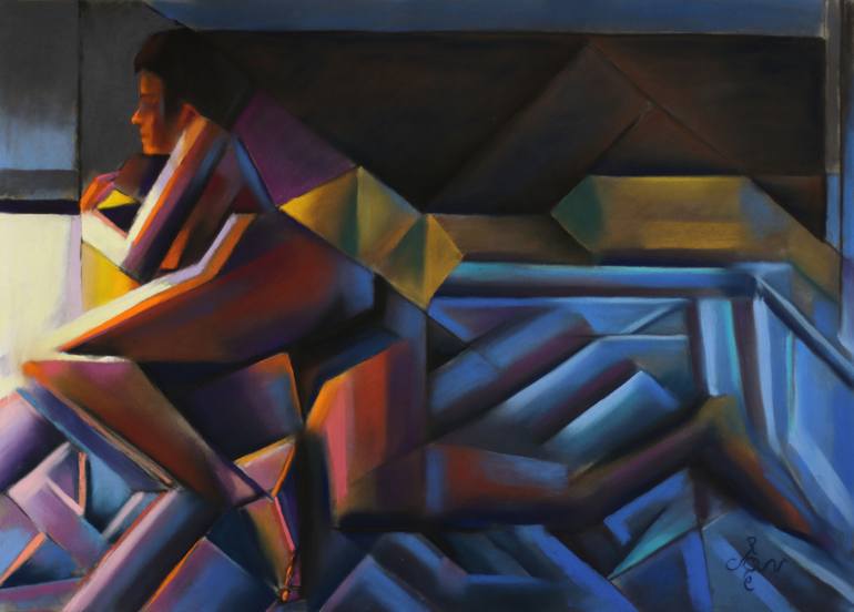
All Things Round? This pastel drawing Golden Night – 08-02-21 is based on a previous graphite pencil drawing Roundism 10-08-20. What I do is to browse through my collection of drawing and just pick one to execute in color. For some reason people seem to like the concept of Roundism – 03-01-16 (sold) very much. Its continuation in pastel Golden Roundism – 03-03-21 gained equal admiration. Surely all things round and voluptious are attractive in the eyes of both male and female art lovers. However, suiting such preference certainly would cramp my style indeed. I am a stubborn kind of artist. If someone likes something about me, I will do the opposite. Rebel without a pause. Back to Spherical Cubism Now seriously. I just want to explore my ideas in each and every direction. Roundism – 10-08-20 I always thought to be a succesful execution of an initial good idea. It was obvious to me I had to go back to my original interpretation of my spherical cubism. Some days back on Reddit I explained my sort of cubism is not to be compared with traditional cubism. It has to be called multi-perspectivism really. I would consider mine a more pure cubist styling without putting a distortion of perspectives in the mix. Hence, my cubism is real cubism rebus sic stantibus. Color There is a certain comfort in redoing old themes I must say. Composition and tonality are just to be copied on a larger scale basically. It is not in the invention of the idea but, as stated before, color is the main driving force now. Was the previous pastel based on the use of unsaturated colors, this one became different. The idea was to use a lot of greyish pigments on a grey Pastelmat sheet. That’s because I had a box of Koh-I-Noor Hardtmuth grey chalks (Set 095) I wanted to use for a change. In the highlights I then would refer to the golden theme and use an array of yellows. In the light of this choice lies the theory of simultaneous contrast. All things gray would appear to look purple. I was mistaken though. Final Color Composition The gray surpassed the yellow from a quantitative point of view so it stayed gray. So I shifted to higher gear. In the reference picture I took during the session I saw there were two different light source. There was the sidetable lighting at the left and the blueish light coming from the right. Because my model’s body also showed orange and pinkish hues at the left the blue hues at the right were badly needed anyway. In order to tune down saturational levels I made a hugh portion of the pastel darker. The result is 5 colors from the color wheel (except for pure red). Green is less so it does not play a grand part. They are not screaming though because I subdued them and let them do my bidding: harmonisation. Pastel drawing on Clairfontaine Pastel Mat paper (69.4 x 49.8 x 0.1 cm) Artist: Corné Akkers
Details & Dimensions
Drawing:Pastel on Paper
Original:One-of-a-kind Artwork
Size:27.3 W x 19.6 H x 0 D in
Frame:Not Framed
Ready to Hang:Not applicable
Packaging:Ships in a Box
Shipping & Returns
Delivery Time:Typically 5-7 business days for domestic shipments, 10-14 business days for international shipments.
Handling:Ships in a box. Artists are responsible for packaging and adhering to Saatchi Art’s packaging guidelines.
Ships From:Netherlands.
Have additional questions?
Please visit our help section or contact us.
Netherlands
1969, born in Nijmegen. My work can be seen in many countries all over the world. Corné employs a variety of styles that all have one thing in common: the ever search for the light on phenomena and all the shadows and light planes they block in. His favorites in doing so are oil paint, dry pastel and graphite pencil. He states that it’s not the form or the theme that counts but the way planes of certain tonal quality vary and block in the lights. Colours are relatively unimportant and can take on whatever scheme. It’s the tonal quality that is ever present in his work, creating the illusion of depth and mass on a flat 2d-plane. Corné combines figurative work with the search for abstraction because neither in extremo can provide the desired art statement the public expects from an artist. Besides all that, exaggeration and deviation is the standard and results in a typical use of a strong colour scheme and a hugh tonal bandwith, in order to create art that, when the canvas or paper would be torn into pieces, in essence still would be recognizable.
Artist Recognition
Featured in Saatchi Art's printed catalog, sent to thousands of art collectors
Artist featured by Saatchi Art in a collection
Thousands Of Five-Star Reviews
We deliver world-class customer service to all of our art buyers.
Global Selection
Explore an unparalleled artwork selection by artists from around the world.
Satisfaction Guaranteed
Our 14-day satisfaction guarantee allows you to buy with confidence.
Support An Artist With Every Purchase
We pay our artists more on every sale than other galleries.
Need More Help?